Blog

Youth Art Month

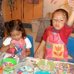
This week, in honor of Youth Art Month, we will be hearing from Gina Moreland, Executive Director of Habitot Children’s Museum in Berkeley, California. The mission of Habitot Children’s Museum is ”to help the broad community of parents and caregivers raise curious, creative and confident children.” Underlying the Museum’s mission is the knowledge that, in the earliest years of life, when brain development is advancing rapidly, intellectual stimulation and parent involvement are crucially important.  Habitot’s Art Studio provides a place where children can express themselves creatively through art. Here’s what Gina had to say…

The great modern artist, Pablo Picasso, famously said, “It has taken me a lifetime to learn how to paint like a child.” The uninhibited and completely creative art of very young children is always in evidence in the Art Studio at Habitot Children’s Museum. Over the past 17 years, tens of thousands of young children, age 0-5, have explored a wide range of art materials and art-making at Habitot – often for the first time. Art Studio Coordinator Nora Garcia, who develops curriculum for the Studio, often says, ”this is where artists are born.”

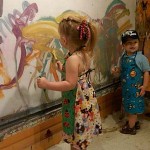
Far too many settings for young children provide what we call ‘school-art’ or seasonal projects where there is one right way to do a project. By contrast, Habitot’s art experiences are open-ended and allow a child to express him or herself with the provided materials, which is what true art is. A giant Lucite sheet is mounted on the wall at one end of the Art Studio. Here, children have an enormous canvas for drawing and painting – and often, several children will work on the wall at once. When they’ve finished, the wall can be wiped down for the next child. “The emphasis is on the art experience, not necessarily the final product,” says Nora. The shifting kaleidoscope of colors on the wall are endlessly fascinating to adults.

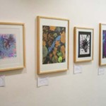
Each year, Habitot presents a Contemporary Art Show to the community with works created in the Art Studio. Invariably, the framed works draw attention and viewers are always surprised to find out they were painted by a child under 5. Some sell for $100 or more. Habitot has plans to relocate the museum to a larger and more accessible building in the next few years so that it can better serve its annual audience of 65,000.

Cloudberry Studio will be leading the Habitot team through the Master Plan and Concept Design, that includes an expansion of the Art Studio.
Posted in:

Children's Museums, Cool Thoughts

Leave a Comment

Tangeez – A Maker Faire Success Story

Now that we know what the Maker Movement is all about, and we’ve learned a little about how organizations are using the movement to inspire creativity in kids, we wanted to feature a couple of makers who have…MADE IT.  Emily Webster and Mustafa Bagdatli, creators of Tangeez have taken their idea from hand-made prototype to manufactured product. Here’s their story…

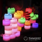
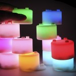
“Tangeez are a set of light-up building blocks that change COLOR as you stack them.  Circular in shape, individually powered and internally ILLUMINATED, Tangeez are both an interactive toy and design object.”

About four years ago, Emily and Mustafa were walking down the street when Mustafa had an idea: “I want to make a light up Lego”. He and Emily had discussed other light-based ideas before, but this was the first idea that they believed could become a product. Emily, an Architect by training and Audio-Visual-Media Designer by profession, and Mustafa, a Creative Technologist and Experience Designer, had worked together on media installations in the past and had the experience to make this “physical pixel” a reality.

The first prototype of was “very hand made”, says Emily. Both the light technology and the housing were made of simple off-the-shelf items, like LED lights and acrylic tubing, that Emily and Mustafa assembled into working models. They weren’t sure what to expect when they debuted their prototype at Maker Faire New York in 2012, but it turned out to be an overwhelming success. People were so enthralled by Tangeez that they wouldn’t leave the table. “Kids were crying when their parents finally made them leave”, says Emily. The prototype was a hit with both kids and adults, and proved that it could be a viable product.

After their success at Maker Faire, Emily and Mustafa were selected as finalists for New York’s Next Top Makers studio incubation program, designed to put New Yorkers at the forefront of the independent innovation boom. This program provided a stipend that allowed Emily and Mustafa to create more refined prototypes and materials to share on KickStarter. Once their refined prototypes and video content was ready, they launched Tangeez on Kickstarter. In only 30 days, they raised over $50,000 to produce a mold that would allow them to begin manufacturing Tangeez through injection molding.

Since their Kickstarter campaign, Tangeez has sold 5,000 individual units (including those sold through the Kisckstarter campaign). They are excited about the possibility of going beyond the web, and selling to stores. And that’s not the end of the road – Emily and Mustafa intend to continue prototyping new models and are considering different sizes, programmable units, and even sound responsive devices. Just like their original prototype, any new prototypes will be hand-made. Emily says that “prototyping goes a long way”, and advises makers to share ideas as a physical form because it will get you further than a rendering.

To learn more about Tangeez, check them out on the web at http://www.tangeez.us/

This week, in honor of the Maker Movement, Cloudberry Studio will be giving away a set of Tangeez to one lucky reader!

TO ENTER the giveaway, go to Cloudberry Studio’s Facebook page https://www.facebook.com/CloudberryStudio

and answer the following question in the Comments section of this post:

How have you or your organization engaged in the Maker Movement?

THE RULES

One entry per person, please.

The winner will be drawn at random from the comments.

We will announce the winner on our Facebook page next Monday, Nov. 24th!

Posted in:

Cool Thoughts, Design Issues

Leave a Comment

Leveraging the Maker Movement

To Enhance Creativity in Children

This week, our friend and guest blogger, Peter Chang, will tell us about his organization, Child Creativity Lab, and how they are leveraging the Maker Movement to enhance creativity in children. Be sure to check out Child Creativity Lab on the web to learn more about upcoming events and how you can get involved!

We had no idea what we were making, but it was exhilarating and the anticipation of something great motivated us to keep hammering away without even a notice of being in the overly dry heat of a Southern California summer.…

The Child Creativity Lab (CCL) is a planned children’s museum with emphasis on enhancing creativity in children.  While awaiting the establishment of the permanent museum, we operate our flagship program, the CCL Museum-on-Wheels, consisting of a mobile educational service that travels to partner locations, focused on creativity-enhancing stimulation and inspiration for pre-kindergarten through 6th graders.  Educational workshops focus on age-appropriate STEM-based activities helping to guide participants in bringing together existing ideas into new configurations, developing new properties or possibilities for something that already exists, and discovering or imagining something entirely new.

The same formidable uphill street that we habitually dreaded riding our bikes on to get home was now intriguing us with something new…a downward slope!

Our specific programs range from storyboard design to bring adventures and personalities to life; various art disciplines introducing children to new ways of seeing and thinking; and other activities supporting increased patience, concentration, and processing and sequencing skills.  With that said, the common thread reverberating through ALL of our activities is the passion to embed a culture and appreciation for hands-on “making”.

An old skateboard, a discarded piece of plywood, miscellaneous remnants at a local construction site, and gardening gloves turned out to be a treasure trove of parts for our proud two-person, gravity-powered, customized go-cart that provided hours and hours of thrilling trips down Santa Anita Avenue. 

We owe much of our inspiration and success to the Maker Movement on a number of different levels.  The movement has generated much needed appreciation of the importance of inventing, designing, and tinkering.  This has helped to create increased pre-existing awareness and enthusiasm in children and families coming into our programs, which would have been met with more suspicion and unknowingness prior to days before the Maker Movement.  The recent trends have also spawned an endless stream of different ideas for projects and activities that we’ve been able to tweak and incorporate into educational programs specifically designed for children.  Finally, and most important to our organization, the Maker Movement has highlighted the issue of the decline in creativity that we’ve seen over the last couple of decades.  While once the leader of the world in innovation, “children (in America) have become less emotionally expressive, less energetic, less talkative and verbally expressive, less humorous, less imaginative, less unconventional, less lively and passionate, less perceptive, less apt to connect seemingly irrelevant things, less synthesizing, and less likely to see things from a different angle.”[1]

While our shoes were worn down from being our quasi brake pads and we came away with scraps and cuts from crashes that we deemed as necessary learning moments that demanded us to continually refine our vehicle contraption, we learned about and expanded our creative abilities and had tons of fun in the process.

As a child growing up, I have very fond memories of tinkering away on inspiring and creativity-building projects in my best friend’s backyard.  As an organization dealing with the current headwinds of the busy lifestyles of dual-working parents, the consuming technology culture of our youth, and standardized testing, we hope to provide the same memories for the children in Orange County.


[1] Kim, K, “The creativity crisis: the decrease in creative thinking scores on the Torrance Tests of Creative Thinking”, Creativity Research Journal, 23:4, 285-295; 2011

Posted in:

Association of Children's Museums, Children's Museums, Design Issues, Professional Development

Leave a Comment

What’s this “Maker Movement” all about?

Defined as individuals or groups using discarded or broken materials to create something new, the Maker Movement first emerged into mainstream culture through Maker Faire, an event created by Make magazine to “celebrate arts, crafts, engineering, science projects and the Do-It-Yourself Mindset”. Since the first Maker Faire in 2006, the movement has grown beyond a single annual festival to include membership-based maker spaces and labs all over the country, that encourage members to create, innovate, and think outside of the box. The results really quite amazing.

Many makers’ innovations take the form of new technology in the areas of robotics, engineering, and electronics. Other creations center around more traditional forms like sewing, wood-working, metal-working, and art. With the growing popularity of DIY culture, it’s no surprise that we’ve started sharing the fun with our kids. The Maker Movement has expanded beyond the adult audience into children’s museums, art centers, and even the classroom at school. Kids are itching for hands-on activities that take them beyond the screen. Just like their parents, they want to “do it themselves” and the learning-through-doing environment of a hackerspace or fab lab is the perfect place for kids to assert their creativity and maybe even get a little dirty.

In addition to kids and parents, the Maker Movement has attracted the attention of educators who desire to engage students in a non-traditional approach to STEAM subjects. Through hands-on problem solving, educators are able to give students the opportunity to see science, technology, engineering, art, and math in action. Infusing elements of the Maker Movement into museum and classroom activities brings subject matter to life. A problem is no longer just words on a page – it becomes something that students can interact with, giving them greater ownership of the problem as well as the steps they take to determine a solution.

For the next few weeks, we will hear from industry professionals on how they have engaged with the Maker Movement, what they’ve learned, and how we can infuse our curriculum with more opportunities for creativity and innovation.

Posted in:

Children's Museums, Design Issues, Events

Leave a Comment

Design for Autism, Conclusion

Over the last several weeks, we’ve looked at some of the key guidelines and issues related to “Design for Autism.” To wrap up this series, we’ll talk about an example of how Cloudberry is trying to put design for Autism into practice — at LifeTown, a new center for recreation, education, therapy, and leadership training currently under construction by Friendship Circle in Livingston, NJ.

To quickly recap the previous posts, Autism is a sensory processing disorder that leads to sensitivity to environmental stimuli. When designing with Autism in mind, some recommended guidelines include:

Maintain “object in content”: People with Autism have an acute visual memory and rely heavily on environmental cues to understand the world around them, so it’s important that environments and experiences be designed to support expectations of sameness.

Facilitate sensory integration:  Environmental design should be kept simple, so children are able to focus. For example, select soothing hues, use natural lighting instead of flickering fluorescents, and provide quiet spaces for “escape”.

Set expectations: Many children with Autism are able to participate in and enjoy an experience more fully if they are able to “prep” for it in advance, so that they understand what the experience will be.

In our design work for LifeTown, we’ve tried to incorporate many of these guidelines, as well as other considerations. Some experiences are intended primarily for children with Autism and other special needs, including:

The Sensory Play Room is an engaging physical play space for children that will be used for a combination of open play, physical therapy, and Friendship Circle programs. Clearly designated areas are set aside for different experiences, including quieter areas to rest or “escape”. The environment is made more immersive and more familiar by layering in a nature theme through graphic treatments and other design elements, so that the space resembles a park — the nature theme is also echoed in other spaces throughout LifeTown, to provide a sense of continuity.

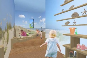
The Sand Room is a multi-sensory experience that evokes the familiar sights, sounds, and textures of a beach in a gentle way.  A soft breeze blows, and the sound of waves helps build the experience.

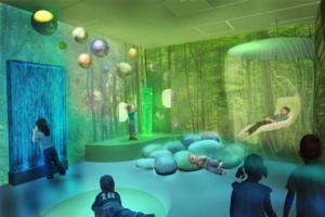
The Snoezelen Room is a calm, safe space with off-the-shelf Snoezelen modules that support a variety of physical and sensory therapy experiences. Design elements evoke the look and feel of a magical forest at night, enhancing this experience and connecting it to the nature theme throughout.

Our design approach had to find a balance among a variety of aesthetic, experiential, and physical needs. We focused first on the fundamental design requirements for a general audience, and then iterated the design to emphasize simplicity, continuity, and familiarity in order to better accommodate those with special needs.

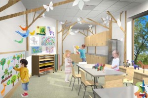
For example, the Art Room is a creative space that supports programming for both adults and children, with all the functionality and materials of a full art studio.  But it also includes design elements that integrate thematically with the other sensory-focused spaces at LifeTown, such as wall treatments with simple images of trees, leaves, and other nature-based patterns.

Throughout the building, a Wayfinding System helps orient visitors and guide them through the building, whatever their age or needs. It begins with a large, color-coded map on the lobby wall to set expectations about the experiences inside. The wayfinding system also includes simple, familiar images related to natural and urban environments, which connect visually to both the nature-themed sensory spaces.

In all of these ways, Cloudberry is trying to design for the special needs of Autism, while also practicing good experiential design in general.

Posted in:

Design Issues, Professional Development

Leave a Comment

Design For Autism : Part 4

More thoughts from Julia Fain and Friends

The second of two articles from our guest blogger, designer and mother Julia Fain.
 

Hello again! In my last article, I shared a little about how my family prepares for different activities. Some of our daily outings take us to public spaces like the grocery store, restaurants, and museums. Here is a bit about what I have experienced with our son, Bryce.

In regard to shopping, Bryce does best if he has tasks to complete, such as looking for foods, pushing the cart, etc. Stores with lots of branding are difficult. When he sees a DVD, or fruit snacks with a super hero, or a new toy he can become instantly passionate and emotional about said product. I know end caps are necessary for marketers but as a mom I am not a fan. Shopping stores like Trader Joes are infinitely easier to shop in due to the smaller store size and lack of branded packaging.

Relating to restaurants, our family almost always eats at fast food or order up front style. They tend to be casual and it isn’t noticeable when Bryce needs to hop up and down while he eats. He can not make it through a sit down restaurant without hiding under the booth. I believe from all the noise and smells and having to sit still. We try to work on this with coloring sheets and breaks (walks outside).

I realize that my experience is very much singular to our family. So I asked a few friends (with children on the autism spectrum) for feedback and they had wonderful ideas.

From my friend Sharon: “…I talk about how the sound of the room overwhelms Caleb; how people’s voices echo if the ceilings are really high, how employees interact with us, if there’s music playing in a foyer…we never ever take an elevator anywhere, so we’re very fond of carpeted stairwells because the carpet absorbs the noise of clanking steps and squeaky doors.” (Sharons blog: http://cayubsmum.blogspot.com/) she writes about autism and her family there.)

From my friend Grace: “…every kid with autism is different! For us too, our major challenge is often loud noises. Interactive play is enjoyed but not if it requires working with other children. For us, drawing is a great way to interact with an exhibit. Our local art museum has a room for children and Elijah loves it, there’s freedom to move around the different centers at will (or skip the ones he doesn’t feel comfortable with), and there’s also a place to try out the same types of art currently on exhibit. (Grace’s blog is here: http://roweadventures.com/)

Multiple friends mentioned their kids disliking automatic hand dryers and toilets. I most definitely agree. If an automatic hand dryer needs to be used, at least give a towel option! And pick driers that aren’t incredibly loud. Also mentioned by my friends to watch for and plan around: crowds, noise level of exhibits, temperature, sounds.


Posted in:

Design Issues, Professional Development

Leave a Comment

Design For Autism : Part 3

Thoughts from Guest Blogger, Julia Fain

Design inspiration and creative motivation most often stems from observing real-world challenges and solutions.  Friend of Cloudberry Studio, Julia Fain, shares some key insights on raising an autistic child from the perspective of a designer.  This is the first of two articles from Julia.
 

When I was asked to share a little about autism and how it affects our family I was all in. My background is in product design and I constantly see ways that businesses could make transitions easier for children on the spectrum. Our son was diagnosed with PDD-NOS on the spectrum by a developmental pediatrician at age four. At that point we had been in speech therapy for a year and a half, with some occupational therapy for picky eating and sensory integration. More recently he has been documented with high functioning autism, similar to Aspergers.

A lot of what I do day today with Bryce involves prep work. I give him a plan, usually three or four things. He is very happy with that but once the plan is set there isn’t room for much deviation. I keep our days pretty basic, I pick grocery stores and libraries and parks that he is familiar with and we have good experiences with. I only try new museums and malls with the support of my husband, especially because I also need to watch his younger sister. This is because he tends to wander in new environments (so much to look at!) and in case he has a meltdown.

Bryce is highly visual, so I often try to do prep-work with photos. Before we started swim lessons I went to the pool-site and took pictures. I then went home and showed Bryce, so the visual picture in his head would be in line with reality. The internet really helps with this. Last fall we took a trip to a cabin in Wisconsin, and he cried a good bit that first day because the logs were vertical instead of horizontal. This summer when we went to the beach I was sure to first show him website photos of our motel and overhead maps. He was all joy when we arrived at the beach motel. And one thing I know Bryce really loves: maps. Visual way-finding maps paired with visual storyboarding is a non-auditory way to communicate with him and it works really well.

Technology is also very very appealing to Bryce. This is often used in wait rooms, which does bring comfort, but it is can also be very hard to transition away from when it is time to leave, or go to an appointment. Fish tanks are a nice alternative. They are soothing to watch, have a mild sound, and aren’t as hard to transition from, at least in my experience!

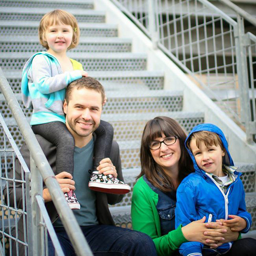
Photo credit: Jenny Rigney http://jennyrigneyphotography.com/
 
 
Posted in:

Design Issues, Professional Development

Leave a Comment

Design For Autism : Part 2

In our first installment of Design for Autism, we talked a little bit about “Object in Content” and how the idea of “sameness” is important as we design the spaces that children with Autism would routinely visit. In this article, we will focus on dealing with “Impaired Sensory Integration as we design.”

First a quick review: Autism is a sensory processing disorder that leads to sensitivity to environmental stimuli. Children with Autism tend to overreact or underreact to environmental stimuli and have difficulty focusing on more than one stimulus at a time.

“Some high-functioning autistic adults describe experiences such as turning off the car radio while trying to read a road sign or turning off a kitchen appliance so they can taste something” (Paron-Wildes). There is a scale for how individuals with Autism experience each of the 5 senses, from hyposensitive to hypersensitive, and it is important to note that different stimuli within the same sense can fall at different places on the scale. An example of this phenomenon would be a child who is able to hear high pitched frequencies that others cannot, but is unable to hear low pitch frequencies.

Most environments we design for children are multi-sensory, featuring sights, sounds, textures, and even smells, simultaneously to create an engaging experience. Good design practice means understanding the role of the environment for children with sensory integration deficiencies. Areas for teaching or therapy, eating, sleeping, and even bathrooms should be simple, so children are able to focus on the task at hand. When selecting finishes and imagery to be used in a space designed for children with Autism, consider the following guidelines:

  • Use pattern intentionally or avoid it entirely. While a simple zig zag or checkerboard carpet tile pattern may be visually appealing, it can become a fixation for a child with Autism.

  • Avoid use of symbols and select photographs that describe activities when possible. While most children will see an image made from shapes, an Autistic child may only see the individual shapes, not understanding the bigger picture.

  • Select appropriate colors and consider natural finishes for furniture when possible.

  • Use natural lighting whenever possible. While we may not notice it, some Autistic children are able to see the flicker of a fluorescent light, which can be distracting.

  • Provide quiet spaces for “escape”.

* Design for Autism from Birth to Early Childhood, by A.J. Paron-Wildes

Posted in:

Children's Museums, Design Issues, Professional Development

Leave a Comment

Design For Autism : Part 1

With the rise in Autism and Autism Spectrum disorders over the past 30 years, it is imperative that designers, educators, and museum professionals rethink the designed environment to meet the needs of both general and special needs audiences. For the next several weeks, Cloudberry Studio will share insights about different elements of design for Autism, with the aim to start conversations around this important topic.

Autism is a developmental disorder that alters the nerve cells and synapses that collect and organize sensory information (sights, sounds, textures, smells, and tastes) within the brain. How this occurs is not well understood, but we do know children with Autism are highly sensitive to environmental stimuli, with a tendency to overreact or underreact. Symptoms become apparent in children before three years of age, and typically include impaired social interaction and communication skills (both verbal and non-verbal), as well as restricted or repetitive behavior. There is no known cure for Autism, and treatment focuses on reducing developmental deficits and stresses, in order to increase quality of life and independence.

While it may not be appropriate (or even possible) to modify all designed environments for Autistic children, we should exercise awareness when designing spaces they routinely visit, such as therapy rooms, schools, and doctor’s offices. These modifications raise their own challenges, because designing spaces for children with Autism is almost counter-intuitive — as designers, we aim to create engaging experiences that integrate sight, sound, texture, and even smell into the environment, but this multi-sensory experience could prove disastrous for a child with Autism.

This week we will focus on a concept called “Object in Content” to learn how following a few basic design principles can help children (and adults) with Autism function better in the environments we design. While the color or placement of objects within a space may seem purely aesthetic or even meaningless to most of us, people with Autism have an acute visual memory and rely heavily on environmental cues to understand the world around them. The term “Object in Content” refers to the Autistic person’s need for “sameness” in a given environment. They learn to recognize certain objects within the location where they encounter them first. Out of context, like a school teacher at the grocery store, they may not be recognized or even understood!

When designing with Autism in mind, here are a few guidelines that consider “Object in Content”:

  • Permanent objects within a given space, like chairs around a table, should all appear to be the same, so slight modification will not cause disruption.

  • Larger permanent objects, such as counters or storage, should be fixed in place so they cannot be moved around the space.

  • Toys and objects should have a specific “place” to be stored for future use.

Be sure to check out our next articles in the series to learn more about this important design challenge.

Posted in:

Design Issues, Professional Development

Leave a Comment

The Power of Intergenerational Play

Play is not just for children…or even just for humans. We have all seen our cats and dogs play with us and other pets, and studies have established that nonhuman primates engage in sophisticated play. Playful behavior has been observed in lizards, turtles, and birds – even fish have been shown to amuse themselves.

As far as humans are concerned, play is a key factor in the social, emotional, physical, and cognitive development for children and as we age. Just as play helps children understand and learn to navigate the world around them, play can help older adults to stay mentally sharp and physically fit. This is where we see the value of intergenerational play. Children who play with adults demonstrate higher levels of problem solving and language skills, in addition to greater levels of creativity than children who play only with other children.

For older adults, play is not only fun, it also helps to maintain cognitive skills, like memory and problem solving, that improve quality of life as we age. Active games benefit adults in the same ways they benefit children, by increasing muscle tone, coordination, reaction time, and ability to adapt to change. Playing with children has been shown to reduce stress and promote relaxation, both of which lead to lower rates of disability and disease.

Historically, daily contact between the generations was a matter of survival. In our changing society, we often divide our communities and activities by age. Children’s museums provide a place where families can learn and play together. Participation in unfacilitated activities and facilitated programming can help strengthen bonds between parents, grandparents, and children, leading to tangible benefits for all generations.

Posted in:

Children's Museums, Professional Development

Leave a Comment